The Psychology Behind Home Colors and Their Influence on Room Atmosphere
The colors used inside a home do much more than improve visual appeal. They influence emotions, energy levels, comfort, and the way people experience different spaces. A carefully selected color scheme can make a small room feel larger, create a relaxing bedroom environment, encourage productivity in a workspace, or make a living area feel warmer and more welcoming.
Interior colors affect human psychology because the brain naturally connects different shades with specific feelings and experiences. While personal preferences and cultural influences also play a role, many colors create common emotional responses that can be used effectively in home design.
Choosing the right colors is not only about following trends. It is about understanding how different shades interact with lighting, furniture, room purpose, and personal lifestyle. A home designed with thoughtful color choices can support relaxation, creativity, comfort, and overall well-being.
How Colors Influence the Feeling of a Home
Every room has a purpose, and color can help strengthen that purpose. The same color may create different effects depending on where it is used.
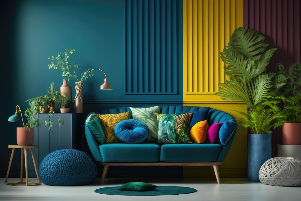
For example, a deep blue shade may create a peaceful feeling in a bedroom but may feel too serious if used excessively in a small living room. A bright yellow wall can bring energy to a kitchen but may become overwhelming in a space meant for relaxation.
The impact of color depends on several factors:
- The size of the room
- The amount of natural light
- Furniture and decoration choices
- The intensity of the color
- The activities performed in the space
Understanding these factors allows homeowners to create balanced interiors instead of choosing colors only based on appearance.
The Emotional Effect of Warm Colors
Warm colors include shades such as red, orange, yellow, beige, and warm browns. These colors are often associated with energy, comfort, and connection.
Warm tones are commonly used in areas where people gather because they create an inviting atmosphere.
Red: Energy and Passion
Red is a powerful color that attracts attention and creates a sense of energy. It can increase excitement and make a room feel more active.
Because of its strong psychological impact, red is usually used carefully in homes. Small amounts of red through cushions, artwork, or decorative items can add warmth without making a room feel intense.
Dining rooms, entertainment spaces, and accent walls are areas where red can work effectively.
Orange: Creativity and Social Connection
Orange combines the energy of red with the happiness associated with yellow. It creates a friendly and energetic atmosphere.
Orange works well in:
- Family rooms
- Creative spaces
- Kitchens
- Exercise areas
Soft orange or peach tones can create warmth without feeling overwhelming.
Yellow: Happiness and Brightness
Yellow is often connected with optimism, sunlight, and positivity. It can make rooms feel brighter and more cheerful.
However, very bright yellow may feel too stimulating when used on large surfaces. Softer shades of yellow are often better for creating a comfortable environment.
Yellow works especially well in:
- Kitchens
- Breakfast areas
- Entry spaces
The Calming Effect of Cool Colors
Cool colors include blue, green, and certain shades of purple. These colors are often associated with relaxation, balance, and freshness.
They are popular choices for bedrooms, bathrooms, and spaces designed for rest.
Blue: Peace and Relaxation
Blue is one of the most commonly used interior colors because it creates a calm and peaceful atmosphere.
Light blue shades can make a room feel open and airy, while deeper blues can create a sense of elegance and stability.
Blue is often suitable for:
- Bedrooms
- Bathrooms
- Reading areas
- Home offices
However, extremely dark blue used excessively may make small rooms feel smaller, so balance is important.
Green: Nature and Balance
Green is strongly connected with nature and has a refreshing psychological effect. It creates feelings of harmony and comfort.
Green works well in almost any area of the home, especially when combined with natural materials such as wood and plants.
Popular uses include:
- Living rooms
- Bedrooms
- Home offices
- Relaxation spaces
Soft greens can create a peaceful environment, while deeper greens add sophistication.
Purple: Creativity and Luxury
Purple has traditionally been associated with creativity, imagination, and luxury.
Light purple shades such as lavender can create a relaxing feeling, while darker purple tones can add drama and elegance.
Purple can be used effectively in:
- Bedrooms
- Creative rooms
- Decorative accents
The Role of Neutral Colors
Neutral colors such as white, gray, cream, beige, and soft brown are extremely popular because they create flexible and timeless interiors.
Neutral colors provide balance and allow furniture, artwork, and decorative elements to stand out.
White: Cleanliness and Space
White creates a feeling of freshness, simplicity, and openness. It reflects light and can make rooms appear larger.
White is especially useful in:
- Small rooms
- Modern interiors
- Minimalist designs
However, too much white can sometimes feel cold. Adding wooden elements, textiles, and warm lighting can create a more comfortable atmosphere.
Gray: Modern and Balanced
Gray is a versatile color that can create a sophisticated and peaceful environment.
Light gray feels airy and modern, while darker gray adds depth and elegance.
Gray works well in:
- Living rooms
- Offices
- Bedrooms
Combining gray with warmer colors prevents the space from feeling too serious.
Beige and Brown: Comfort and Warmth
Earthy neutrals such as beige and brown create feelings of stability and comfort.
These colors are excellent for creating cozy environments and work well with natural materials.
They are commonly used in:
- Living rooms
- Bedrooms
- Dining areas
Choosing Colors Based on Room Purpose
Different rooms serve different functions, so their colors should support the activities performed there.
Bedroom Colors for Better Relaxation
Bedrooms should encourage rest and comfort. Soft and calming colors are usually the best choices.
Recommended options include:
- Light blue
- Soft green
- Warm beige
- Gentle gray
- Lavender
Avoid overly bright colors that may create too much energy before sleep.
Living Room Colors for Comfort and Social Interaction
Living rooms are spaces for conversation, entertainment, and relaxation. Colors should create a welcoming atmosphere.
Good choices include:
- Warm neutrals
- Earth tones
- Soft greens
- Balanced blues
Adding colorful decorations allows homeowners to introduce personality without overwhelming the space.
Kitchen Colors for Energy and Freshness
Kitchens often benefit from bright and clean colors.
Popular choices include:
- White
- Cream
- Light gray
- Soft yellow
- Natural wood tones
These colors create a fresh environment while allowing food and decorative elements to become visual highlights.
Workspace Colors for Focus and Productivity
A home office should support concentration and creativity.
Helpful colors include:
- Soft blue
- Green
- Neutral gray
- Warm white
Very distracting colors may reduce focus, especially during long working hours.
How Lighting Changes Color Appearance
Lighting has a major influence on how colors appear. The same paint color can look completely different depending on natural and artificial lighting.
Natural sunlight usually makes colors appear brighter, while warm artificial lighting can make them appear softer.
Before choosing a paint color:
- Test samples on the wall
- Observe them at different times of day
- Consider room lighting conditions
This prevents disappointment after painting an entire room.
Using Color to Change the Perception of Space
Colors can influence how large or small a room feels.
To make a small room appear larger:
- Use lighter colors
- Increase natural light
- Choose similar shades for walls and furniture
To create a cozy feeling in a large room:
- Use warmer colors
- Add deeper shades
- Introduce textured materials
Color placement can also influence room proportions. For example, a darker ceiling can make a room feel lower and more intimate.
Combining Colors Successfully
A balanced color scheme usually includes:
- A main color
- Supporting colors
- Accent colors
The main color covers larger areas such as walls. Supporting colors appear in furniture and textiles. Accent colors are used for decorative details.
A good balance prevents rooms from feeling boring or visually overwhelming.
Avoiding Common Color Mistakes
Some color choices can negatively affect the atmosphere of a home.
Common mistakes include:
Using too many strong colors at once can make a space feel chaotic.
Ignoring lighting conditions may result in unexpected color changes.
Following trends without considering personal comfort can create a home that looks fashionable but does not feel relaxing.
Choosing colors only because they look good in another home may not work because every space has different lighting and proportions.
Creating a Home That Reflects Personality
While color psychology provides useful guidance, personal connection is equally important. A home should represent the people who live there.
Favorite colors, memories, cultural influences, and lifestyle preferences all contribute to a comfortable environment.
The best interiors combine psychological understanding with personal expression. A peaceful home is not created by rules alone but by choosing colors that make people feel comfortable and happy.
Conclusion
Home colors have a powerful influence on emotions, atmosphere, and daily experiences. The right shades can encourage relaxation, improve focus, increase energy, and make rooms feel more welcoming.
Understanding the psychological effects of colors helps homeowners make better design decisions. Whether choosing calming bedroom tones, productive workspace colors, or inviting living room shades, thoughtful color selection can transform the feeling of a home.
A successful color design is not about choosing the most popular trends. It is about creating spaces that support comfort, personality, and the lifestyle of the people who live there.
Frequently Asked Questions (FAQs)
1. What colors create the most relaxing home environment?
Soft colors such as light blue, green, beige, lavender, and warm gray are commonly used to create relaxing and peaceful environments.
2. Which colors make a room look bigger?
Light colors such as white, cream, soft gray, and pastel shades can make rooms appear larger by reflecting more light.
3. Are dark colors bad for small rooms?
Dark colors are not always bad for small rooms. When used carefully through accent walls or decorations, they can add depth and elegance.
4. What is the best color for a bedroom?
The best bedroom colors are usually calming shades such as blue, green, beige, gray, and soft neutral tones that encourage relaxation.
5. Can colors affect productivity?
Yes. Colors such as blue and green are often associated with focus and balance, making them suitable for workspaces.
6. Should every room in a house have the same color scheme?
Rooms do not need identical colors, but using connected shades throughout the home can create a more harmonious appearance.
7. How do I choose the right paint color for my home?
Consider room purpose, lighting, existing furniture, personal preferences, and test paint samples before making a final decision.
8. Are color trends important when designing a home?
Trends can provide inspiration, but comfort and personal preference should be the main factors when choosing home colors.